
METALSITE / BRAND KITA familiar name.
A familiar name.
A material signature.
The wordmark people already know, with a proposed M built from connected metal strips. One place for clean files, useful formats and a consistent visual language.
142 files · SVG, PNG, JPG & color files1.4 MB ZIPEdition November 2026
COMPANION LOCKUP / CONCEPT The live wordmark remains the primary identity.
Keep the recognition. Add a connection.
The supplied dimensional M suggests folded sheet metal and interlocking parts. That is a useful idea for a marketplace connecting materials and people. A flatter companion translates the idea into a mark that can also work on a small screen, a document or a single-color label.
Current primary wordmark
The name stays familiar.
Keep the existing lettering, tight spacing and black-and-cyan split. Use this as the main signature in the website header, business documents and references to MetalSite.
Download current identityProposed companion family
A mark that feels made of metal.
The folded M carries the industrial character. The compact M keeps a stronger silhouette at small sizes. Both are review concepts; they have not replaced the live header or browser icon.
Explore the companion concept ↗01 / LOGO FILES
Current identityThe original wordmark, ready to use.
Use SVG for scale and crisp edges. PNG exports have transparency; JPG versions include a deliberate white or navy background. All versions preserve the existing artwork and spacing.



















CURRENT IDENTITY / SOCIAL PROFILES
Download profile logosSquare logos for Facebook and X.
The existing MetalSite lettering in a square format. Use the full name or the original lowercase “m” for a compact avatar. Solid backgrounds and clear space keep the artwork inside a circular profile crop.
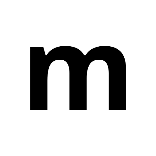
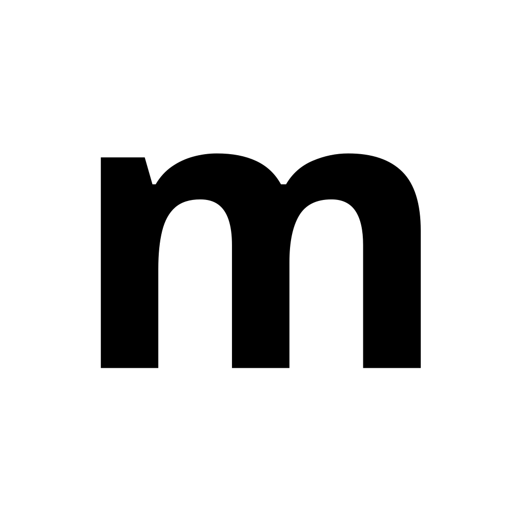





PNG and JPG files are square and ready to upload to a profile. Check the platform’s final crop before saving. The circle previews are illustrative; the downloads retain the full square background.
02 / COMPANION CONCEPT
For reviewFrom folded metal to a clear M.
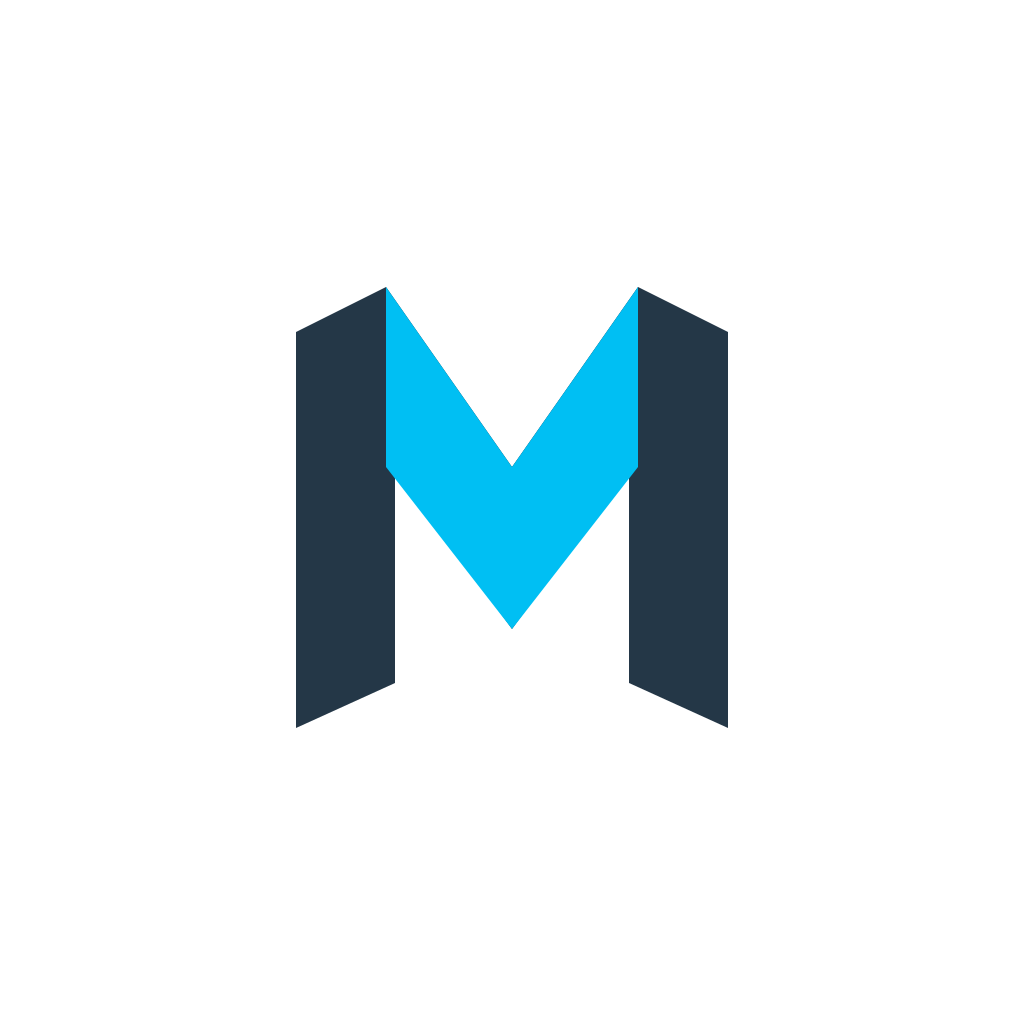
The crossing front strip gives the folded mark its metal character. The compact mark removes the secondary faces for a more direct M. Preview each on a real background before choosing a format.
COMPANION CONCEPT · FOR REVIEW





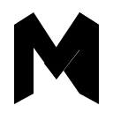
These companion downloads are separate from the current identity. The complete ZIP labels them in a concept folder so a new mark is not mistaken for an approved replacement.


Make the small version a deliberate choice.
Below 32px, start with the compact concept and check it at actual size. The strip below shows the supplied PNGs at their native pixel sizes. A square tile is a presentation asset; it does not imply an available mobile app.










Cyan gives it energy. Ink gives it weight.
The current logo accent is #00BFF3. The website’s interface blue is a separate color. Use cyan as a brand accent, and darker ink for small text on light surfaces.
MetalSite Cyan
#00BFF3RGB 0, 191, 243Primary wordmark accent and companion concept
Interface Blue
#159CCERGB 21, 156, 206Current website controls
MetalSite Ink
#243747RGB 36, 55, 71Text and companion structure
MetalSite Navy
#263C4DRGB 38, 60, 77Dark surfaces
Steel
#94A3ADRGB 148, 163, 173Supporting companion concept face
Paper
#F4F7F8RGB 244, 247, 248Light surfaces
Black
#000000RGB 0, 0, 0Primary wordmark and single-color work
White
#FFFFFFRGB 255, 255, 255Reversed wordmark and single-color work
:root {
  --ms-cyan: #00BFF3;
  --ms-interface-blue: #159CCE;
  --ms-ink: #243747;
  --ms-navy: #263C4D;
  --ms-steel: #94A3AD;
  --ms-paper: #F4F7F8;
  --ms-black: #000000;
  --ms-white: #FFFFFF;
}These are digital RGB values. For print-critical work, approve a physical color proof rather than assuming an automatic CMYK conversion will match.
Simple type. Specific language.
Aa Bb 123
Open Sans
Good metal. Better connections.
Regular for reading, semibold for labels and bold for clear headings. This is the family used by the current website.
font-family: "Open Sans", Arial, sans-serif;Write MetalSite in running text.
The supplied wordmark uses its established lowercase lettering. In headlines, descriptions and ordinary sentences, keep the name together as MetalSite.
Keep the lettering as artwork.
Use the outlined SVG instead of retyping the name. Do not loosen the letter spacing, separate “metal” and “site,” or redraw the trademark glyph in the supplied file.
Useful over grand.
Describe the product, grade, quantity and next step clearly. Avoid claims of guaranteed quality, universal verification or a completed service unless there is evidence for that specific claim.
Give the mark room to work.
Add empty space around the artwork equal to at least one quarter of its height. The downloaded files contain artwork bounds; your layout supplies the margin. Start with a 140px-wide wordmark, a 32px folded mark or a 16px compact mark, then check legibility at the final size.
Keep these consistent
- Use the full-color wordmark on light surfaces and the reversed version on dark surfaces.
- Preserve the aspect ratio, lettering and supplied colors.
- Use SVG when possible, or a PNG with enough pixels for its placement.
- Use the compact concept when secondary faces are too small to distinguish.
Avoid these changes
- Stretching, tilting, adding glows or inventing new shadows.
- Placing the logo over a busy image without a quiet contrast area.
- Mixing the supplied dimensional wordmark with the existing lowercase one in the same signature.
- Using brand assets to imply an endorsement, verified supplier status or a commercial relationship.
A short, accurate introduction.
MetalSite is a marketplace for physical metals. Buyers and sellers can prepare material specifications, publish moderated listings and buy requests, explore company references and exchange private proposals.
For co-branding, modified assets or permission requests, contact MetalSite. These files identify the platform; they do not establish membership, supplier approval or an endorsement.
Pick the pack that fits the job.
Current identity
61 files: the live wordmark, square profile logos, one-color variants, current favicon, social cards and color files.
906 KB ZIP · 2026-11
Download current identityProfile logos
Square current-wordmark and lowercase m logos for Facebook and X: SVG, PNG and JPG, with light and navy backgrounds.
191 KB ZIP · 2026-11
Download profile packCompanion concept
81 concept assets: folded and compact M marks, companion lockups and square tiles, plus the guidance README.
525 KB ZIP · 2026-11
Download concept packComplete brand kit
142 files with both families clearly separated, digital swatches and a practical README.
1.4 MB ZIP · 2026-11
Download complete kitNeed just one file? Use the format links above. SVG stays editable and sharp; PNG works in presentations and everyday design tools.
A clear signature in a wider frame.
Two 1200 × 630 digital cards using the current wordmark. Keep the artwork centered when adapting a crop, and check the destination preview before publishing.
Light card
Dark card